Why Websites Are Starting to Feel Like Apps
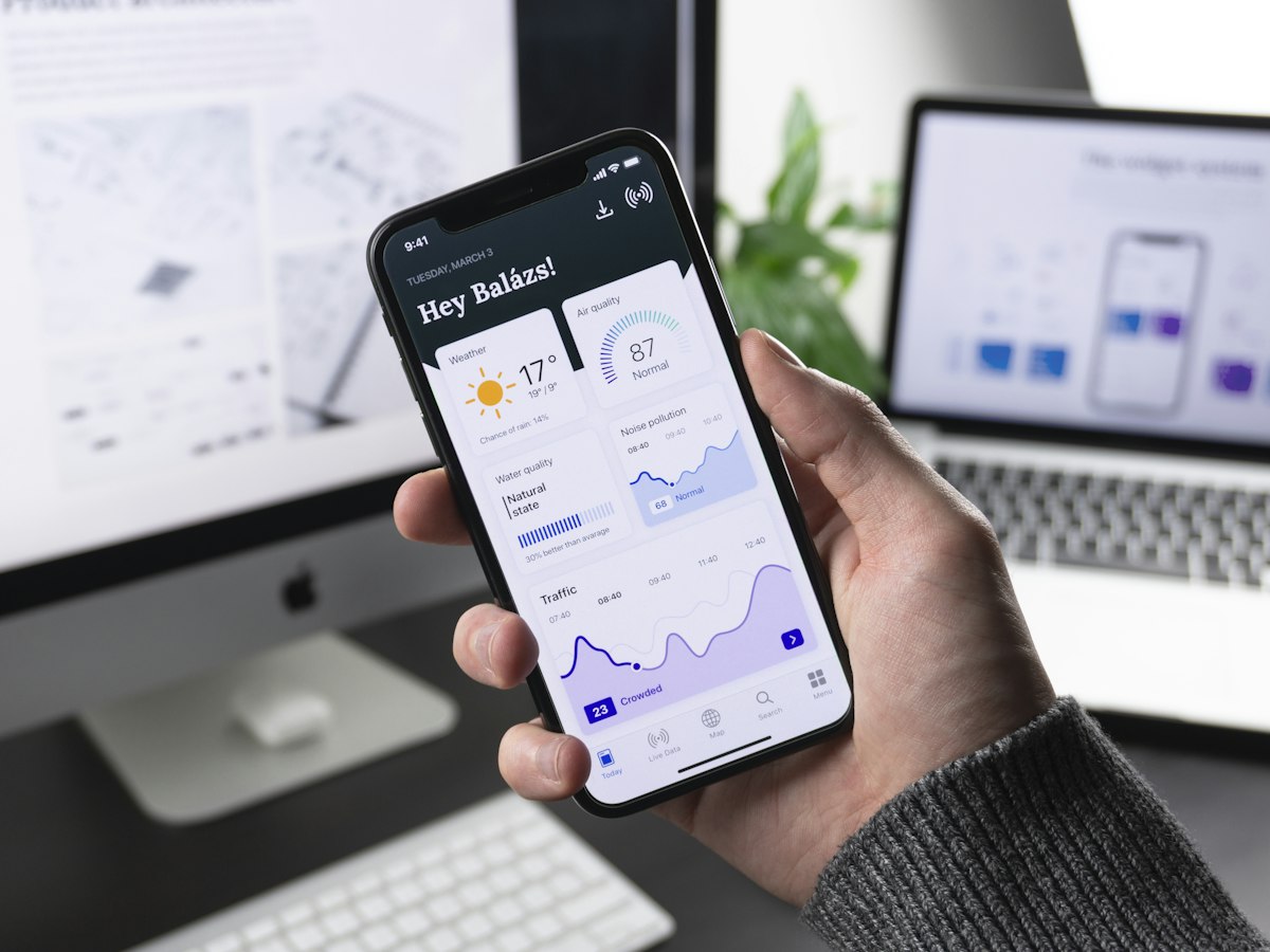
Click a link on most websites and you get the same thing you got in 2005: a white flash, a blank moment, then the new page snaps into place. Native apps never worked this way. They slide, fade, and morph between screens, and that smoothness is a big part of why apps feel premium while a lot of websites feel a little cheap by comparison.
That gap is finally closing. A browser feature called the View Transitions API lets an ordinary website animate between pages the way an app does, and it has crossed the line from experimental toy to something we can confidently ship to clients.
In a Nutshell
- The View Transitions API is built into modern browsers and animates the jump from one page to the next instead of showing a hard flash.
- It used to require a heavy JavaScript framework. Now a fast, simple website can have it too.
- The payoff is perceived speed and polish: your site feels quicker and more premium even when the underlying load time is the same.
- It is supported in Chrome and Safari, with Firefox catching up, so a growing share of your visitors will see it today.
- It still takes craft. Done carelessly, transitions feel sluggish or gimmicky instead of smooth.
What Actually Changed
For most of the web’s life, getting app-like transitions meant building a “single-page application,” where one giant bundle of JavaScript takes over navigation and redraws the screen itself. That approach delivers smooth movement, but it comes with the exact baggage we’ve warned about before: bloated downloads, slower first loads, and code that’s hard to maintain.
The View Transitions API removes that tradeoff. The browser itself takes a snapshot of the current page, loads the next one, and animates between the two. You get the smooth motion without shipping a heavyweight framework to make it happen. Chrome’s web platform team and standards bodies have been pushing the feature forward, and cross-page support is the part that finally made it useful for normal marketing sites rather than just apps.
There’s a second flavor too. A shared element, say a product thumbnail in a grid, can visually grow into the hero image on the next page. The eye follows one continuous object instead of resetting. That single touch is the difference between “a website” and “an experience.”
Why This Matters for Your Business
This is not about decoration. Smooth transitions change how people perceive your site in measurable ways.
| What the visitor experiences | Why it matters |
|---|---|
| No jarring white flash between pages | The site feels faster, even with identical load times |
| Continuous, app-like motion | Your brand reads as modern and well-built |
| Clear visual links between pages | People understand where they are and stay longer |
| Polish that competitors lack | A subtle but real edge on first impressions |
Perceived performance is its own metric. A site that feels instant keeps people browsing, and that’s true even when the actual numbers haven’t moved much. For a small business trying to look as credible as a much larger one, this kind of detail does a lot of quiet work.
Where It Still Takes Craft
The feature is easy to switch on and easy to misuse. We see three traps:
- Too slow. A transition that lingers for half a second feels worse than no transition at all. Good motion is quick and almost subconscious.
- Too much. Spinning, zooming, and sliding everything turns a polished site into a carnival. Restraint is the whole point.
- Forgetting the basics. Animation can’t rescue a slow server or a heavy page. The foundation still has to be fast, accessible, and built on clean, semantic markup, including respecting visitors who ask their device to reduce motion.
In other words, the API hands you a powerful brush. Whether you paint something elegant or something noisy is still up to the people doing the work.
How We Use It at Pulsite
Our stack already leans in this direction. We build on Astro, which has first-class support for view transitions baked in, so we can add app-like navigation to a site that’s still served as fast, lightweight pages. That combination is the sweet spot: the speed and SEO benefits of a traditional website, with the fluid feel people associate with native apps.
We treat transitions the way we treat any animation, including our work with GSAP: in service of the content, never in front of it. The goal is for a visitor to walk away thinking your site felt great, without being able to point to the exact moment that made them feel it.
Want Your Site to Feel This Way?
If your current website still flashes white on every click, you’re leaving an easy impression on the table. The technology to fix it is here, it’s well supported, and it doesn’t require bolting on a heavy framework to get it.
Tell us about your project → and we’ll show you what app-like navigation could look like for your brand.
Curious how this fits with building fast in the first place? Read why page speed matters for your website.